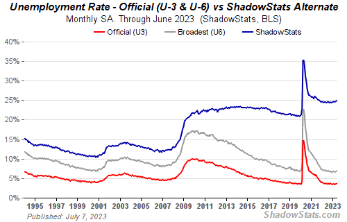
Might not be as rosy as one would think.
The chart below is from http://www.shadowstats.com SGS looks at the way government reports things ..a little differently now.
H/T to Stephanie over at FEDUP USA for her noteworthy compilation demonstrating why this chart is important.

An improvement is an improvement. Understood, but one should always be questioning methodology. Further, as we have seen in the recent past, Upticks in positive figures are great for headlines, but a week, or month later, those headline markers have been ‘revised’, yet not getting the fanfare in the same manner as the positive news.
No surprise at all.